-
1
Floyd Road Mural (1976), Greenwich Mural Workshop. Photo: Henry Broome.
Published: Art Monthly, May 2025
Artificial Local Colour
Property developers strategically commission poly-chromatic sculptures and installations to try to imbue sterile, soulless urban environments with an atmosphere of life and energy, a kind of ‘artificial local colour’ to make up for the absence of any real cultural vitality, an attempt to recreate the soul and the infinitely varied forms of joyous expression that spontaneously pour from the kind of long-established, marginalised communities that are often displaced and destroyed by redevelopment schemes.
Greenwich Peninsula, for instance, is the site of a new luxury property development in south London, one of the largest single regeneration projects in Europe. Ten years in to a 30-year development plan, which began in 2013, real estate firm Knight Dragon is building 17,000 luxury apartments on the site. The Hong Kong developer has already completed its Design District section of the Peninsula, which features 150,000sqft of workspace and a raised walkway called The Tide from the same architects who designed New York’s controversial High Line, which was described by Jeremy Moss in the New York Times as ‘another chapter in the story of New York City’s transformation into Disney World’ and ‘a catalyst for some of the most rapid gentrification in the city’s history’. The entrance to the Design District features Rainbow Halo, a sculpture created by jewellery company Tatty Devine; the arch of multicoloured stars is inspired by one of the brand’s collections. Lighting up at night, the stars – so the inscription tells us – represent ‘love, peace, unity, luck, magic and joy all in a cosmic harmony’. Yet not everyone is welcome here: the developer has promised a mere 1,800 affordable homes, just 11% of the total 17,000 units, falling significantly below Greenwich Council’s target of 35%. Homeowners on the Peninsula will belong to a small social group of affluent buyers or speculative landlords and, except for a few individuals who secure so-called affordable units, only the rich will be able to live here. Without the artists and designers in the Design District studio spaces, or the tourists and day-trippers here for the shops and cafes, table tennis and crazy golf – not forgetting the kaleidoscopic, oversized sculptures – the Peninsula development would be a monocultural dead zone.
Developers use multicoloured public art to distract us from the real violence of property financialisation. This has been going on for years, all over the capital, not just on Greenwich Peninsula but also at Elephant & Castle (‘London’s so-called ‘Gentrification Ground Zero’), Canary Wharf, Battersea Power Station and Bankside. Two decades ago, in 2006, for example, Ian Davenport created a Bankside installation titled Poured Lines. The 50-metre wall of thinly striped multicoloured steel panels was largely funded by Land Securities Properties, a luxury real estate developer known for losing a £60m legal battle with HMRC in 2013 over a scheme described at the time by Treasury minister David Gauke MP as ‘flagrant tax avoidance’. The Greenwich Peninsula development turned to the same artist who, in 2023, created a more site-specific work for The Tide walkway. Covered in blindingly bright colour, these developer-funded artworks are flashy advertisements to sell expensive flats. The works operate as dazzling stand-ins for racialised working-class people pushed out by sky-high house prices, a social group excluded from developers’ masterplans and hence refused a share in the possible transformative benefits of urban renewal.
Artists and designers associated with the ‘New London Fabulous’ movement feature across the Peninsula. Conceptualised by Adam Nathaniel Furman in a 2020 Dezeen article, he describes the NLF movement as a design and architectural style that is ‘highly aesthetic, sensual and celebratory of mixed cultures’, associated with ‘international cross-fertilisation’ and ‘quite a lot of campiness’; Furman named artist-de-signers Morag Myerscough, Camille Walala and Yinka Ilori as stylistic proponents. All three have been commissioned to make public artworks on real estate developments across the capital. On the Peninsula, a government-designated Opportunity Area, in the area just below The Tide walkway, Myerscough has decorated a pair of London Underground ventilation shafts with eye-popping cuboidal patterns intended to distort the outline of the towers, though the noisy ‘whoosh’ of a train every 30 seconds is a constant reminder of their function. Titled Siblings, the artist-designer said of the work: ‘By using vibrant colours I made them bold and strong, making them belong,’ revealing a somewhat superficial commitment to community and spatial inclusion that is ultimately only skin deep.
Furman himself created a public art piece for Canary Wharf titled Click Your Heels Together Three Times, which covers the underside of the Adams Plaza footbridge with rainbow-striped vinyl. Installed for Pride month 2023, Furman quotes the camp sparkle of Judy Garlard’s iconic ruby shoes from the 1939 film musical The Wizard of Oz. The plaque says it is ‘a celebratory sheath of colourful, dramatic drag’, while at the same time describing his practice as ‘embedding queer-coded artworks within the public realm’, claiming a solidarity with LGBTQ+ communities that is paradoxically performative and bold but yet ‘coded’ and hidden. When seen across London’s premier development scheme, however, this type of multi-coloured art is a floating signifier that can mean anything and everything – or nothing at all.
Canary Wharf may ostensibly seek to create a welcoming environment for people of every race, religion or sexual orientation, but it is a no-go zone for people from lower-income neighbourhoods. Solely focused on managing perceptions rather than enacting real change, the corporate language of diversity and inclusion washes over systemic inequality and discrimination, distracting from demands to equally redistribute wealth, property and power. The multicoloured art that developers commission represents socially excluded groups on a purely symbolic level, while on a very real material level the same developers bulldoze their homes. Neighbouring Limehouse, Poplar and Canning Town contain parts of the poorest areas in the country, according to the UK Index of Multiple Deprivation, which measures income, employment, education, health, crime, barriers to housing and services and living environment. In Anna Minton’s 2009 book Ground Control: Fear and Happiness in the Twenty-First-Century City, the author interviews a hairdresser from the Isle of Dogs, which is situated on the Thames, directly below the Wharf and in the long shadow of banking HQs (that are now, post-Brexit and post-pandemic, being redeveloped into luxury high-rise housing). Asked if she uses the shops at Canary Wharf, Pat said, ‘I don’t like going there. It always gives me the fear.’ She feels she could never belong there; it’s just not a place for people who grew up in council houses. For her, it is a segregated area, ‘a private city within a city’, to quote Minton.
British-Nigerian artist-designer Yinka Ilori MBE designed a basketball court for the Canary Wharf development, which opened in 2021. The floor is blocked out in areas of yellow, pink and peach in the form of a sun rising up behind a rectangular edifice, suggestively invoking Canary Wharf as a place of hope and freedom. Illori commented, ‘I love that it’s inclusive and gives somewhere for the community to get together’, but there is no real shared collective feeling here, no sense of people linked by social bonds – just shoppers, security guards and short traders betting on the collapse of the global economy, co-existing but separate, their lives never coming into contact. The slogan ‘Be the best you can be’ is emblazoned across the court floor, promoting individual ambition against collective upliftment. When it was relaunched in 2023, professional British Basketball League team the London Lions provided free coaching sessions for the ‘local community’, as seen in pictures on the Canary Wharf Estate’s website, the individual excellence of a few elite black athletes held up as signs of inclusion. Ilori’s installation could be considered the direct opposite of David Hammons’s Higher Goals of 1986, a New York public art work that was sited in the African-American neighbourhood of Brooklyn: installed for just a year, it was made up of five unreachably high basketball hoops, ranging between 20ft and 30ft. ‘It’s an anti-basketball sculpture,’ the artist explained. ‘Basketball has become a problem in the black community because the kids aren’t getting an education. They’re pawns in someone else’s game. [...] You should have higher goals in life than basketball.’ Through his art and his words, Hammons calls out systemic racism directly. He is trying to raise African-American political consciousness rather than offer false hope, pushing black children to aim higher than the regulation hoop height of 10ft, higher than the lottery of making it pro in the NBA, higher than one-off corporate DEI initiatives, to instead get a good education and to completely transform the state of play, for each and every person to gain the ability to control their own destiny, to refuse to participate in a rigged game, to create a society in which no one individual’s success comes at the cost of anyone else, ultimately to build collective power. What if it was possible to achieve radical urban transformation, driven from the bottom up, by and for marginalised and dispossessed citizens? What if a public art could offer a projection of that vision?
As well as commissioning permanent sculpture and installation designs to be embedded into architecture, developers also put on constant programmes of colour-infused events, hoping to attract outside visitors, bringing retail revenue and buzz to the area as part of the site’s commercial activation. In 2024 at Greenwich Peninsula, for example, there was summer season of culture that included an outdoor cinema with showings of Barbie and La La Land, movies bursting full of colourful Tinseltown costumery. There was also an artist-led ‘Chromatic River Walk’, all intended to create a feeling of carefree fun and hallucinatory abandon, distracting from the ugliness of gentrification, displacement and exclusion. Colour-washing starts at the planning stage, and is then carried through the build process to the post-completion phase. This chroma-overload is by no means accidental: it is part of a planned, multi-phase strategy. Seen across residential as well as retail-office schemes throughout London, developers try to inject cultural vitality at every stage of ‘regeneration’, literally to infuse colour into the concrete of their buildings.
Southwark Notes is a local group that documents and campaigns against gentrification in the borough, active in the tragically unsuccessful battle to save the Elephant & Castle Shopping Centre, which was reduced to rubble in 2021. On Southwark Notes’ blogsite, there is a section titled ‘Art and Regeneration in Southwark: The Fine Art of Regeneration in Southwark’ that cites a 2010 promotional film presenting Southwark Council’s ‘Cultural Vision for Elephant & Castle’. Made by PR and marketing firm DHA Communications in the run-up to the area’s gentrification, a palette-knife-wielding hand artistically smears bright oil paints over photos of the shopping centre, including over the iconic pink Elephant and Castle statue, and over the Heygate Estate, which was mostly council homes and which was demolished in 2014
(see Andrew Hunt’s ‘Public Art Attack’ in AM380). All ‘brushed away’, writes Southwark Notes. The film treats Elephant & Castle like a blank canvas, replacing existing vibrant cultures with artificial colour. Layers of local memory, built up collectively over time, are erased in an instant. Southwark Notes describes the film as a ‘potent’ metaphor of ‘cultural colonisation’, highlighting a segment in which ‘an Asian market stall owner gets painted out [leaving] only a cluster of white dummies in the area!’. Real estate asset management firm Delancey are replacing the shopping centre with 1,357 new housing properties, just 16% at ‘affordable rent’. (‘Affordable rent’ homes are let at around 80% of local market rents, while ‘social rent’ is set at about 50%.)
Like a lot of similar schemes, the ‘regeneration’ of Elephant & Castle was always going to disproportionately harm non-white populations. According to the 2011 Census, more than 120 languages are spoken in Southwark; three-quarters of reception-age children in the borough are from black and minority ethnic groups; 39% of residents were born outside the UK, including a significant Latin American diaspora population, and Spanish is the second most commonly spoken language.
The shopping centre used to be full of Latinx-owned restaurants, food stalls, hair salons, jewellers, cafes, tailors and a travel agency, all run by people from Colombia, Brazil, Chile, Peru, as well as from the Caribbean, West Africa and South Asia – flags from all over the world were proudly displayed in shopfront windows. As a report by local charity Latin Elephant describes, Latinx retailers started setting up businesses in the area at the beginning of the 1990s, and over the years it became a meeting point for London’s Latin American diaspora. Some traders have been relocated to new units around Elephant & Castle but the area is noticeably drained of genuine as opposed to artificial colour. There has been an aggressive ‘greying of urban space’, a phrase Liverpool University professor of architecture Ola Uduku uses to describe the gentrification of Manchester’s Curry Mile, where Asian and African/Caribbean businesses have been replaced by privately built university accommodation. Uduku uses ‘greying’ both literally and figuratively, referring to the growing presence of white faces as well as increasing barriers to move freely in public space – whiteness a metaphor for spatial control.
In the construction phase, Greenwich Peninsula developer Knight Dragon commissioned Myerscough to paint nine, 100m-high cranes for their premium ‘Upper Riverside’ development. The cranes were installed from 2016 for an unknown period: a temporary ‘artwork’ titled Colourblock Cranes, the project was a pre-advertisement for the new development, then only just emerging from the excavated ground. Effectively, Myerscough turned building machinery into art, aestheticising the actual construction process, elevating spatial exclusion to an art form. (I previously looked at the way developer-funded art incorporates industrial construction materials and methods in my 2024 Ebb magazine essay ‘Lines for Redevelopment’.)
Today, Myerscough’s cranes have either been resprayed or sent to another site – when I visited, the cranes were standard red or yellow – but pictures online show the cranes were painted in two-way combinations of bubble gum pink, neon lemon, sky blue, ‘tangerine dream’ orange, big-tick green and fluorescent duck egg blue – all irrepressibly positive (neighbouring residents looked on with terror, knowing their rent would soon shoot up). In 2002, artist Catherine Yass was commissioned by the Canary Wharf Group to make a film titled Descent. We see the view from a camera as it is steadily lowered from an 800ft crane over the course of eight minutes. We’re taken down the side of a partially completed sky-scraper with only the floors and steel supports in place; there is not yet any glass. Yass places the camera upside down, giving you the feeling that you are being dangled by your feet from the crane hook, which seems to threaten, at any moment, to drop you onto the concrete slab below. As the camera descends through the thick grey fog, a vertiginous real estate empire emerges, the developer’s vision becoming a reality with a sense of slow terrifying inevitability. As part of this commission, Yass created a series of blurred, long-exposure, colour-enhanced photographs: presented backlit by a light box, streams of red, yellow and blue breathe life into the inanimate concrete, steel and glass. Whereas Myerscough’s cranes were commissioned to create the impression of fun and energy, attracting prospective customers to the sales and letting suite, Yass’s film and photos work to provide a permanent, celebratory record of the construction process, a kind of photokinetic ‘topping out’ ceremony, reifying Canary Wharf ’s vibrant transformation, from tired former-industrial wasteland to the thriving Manhattan-on-Thames it is today.
Knowingly or not, these artists are entirely complicit in the developers’ programme of colour-washing gentrification. Yass, for instance, was granted access to the site for three months to shoot, while it was the developers who paid all the artists for their artworks. I don’t want to individualise the problem by laying the blame entirely on them, however; in the end, the artists’ work is merely a product of the source of funding, while the overall style of many of the works reflects the interests of Knight Dragon, Canary Wharf Group and Delancey. Colour is no doubt mandated in the design brief and there is no possibility of creating work for communities on the margins or critiquing spatial exclusion when it is the developers who are driving the process. As detailed by public art think tank ixia’s 2022–23 report, ‘Why Public Art, Why Now?’, property developers have become one of the main sources of funding for public art, financed through Section 106 Agreements (S106), also known as ‘planning gain’. This is in effect a state-authorised bung: the developer agrees to contribute towards council infrastructure and services in exchange for planning permission.
The answer to public art is not more or less colour but changing funding structures. While S106-financed public art has become ubiquitous today, other funding models have existed in the past that have supported radically different types of artistic expression. As Ben Wiedel-Kaufmann writes in For Walls with Tongues: An Oral History of Street Murals 1966–1985, the British mural movement, which flourished between the late 1960s and mid 1980s, was supported by funding from local authorities, trusts and the Arts Council of Great Britain (ACGB). The ACGB offered devolved control to the Scottish and Welsh Arts Councils – and to a degree as well the English Regional Arts Associations (RAAs) – and awarded around £1.5m to community arts practitioners from 1974 to 1980. Artists painted local people in their work, made art for schools and community centres, created anti-racist murals such as the famous Cable Street Mural. It was not to last, though; as Wiedel-Kaufmann notes, grants to community cultural initiatives and RAAs were among the first to go under Margaret Thatcher’s swingeing cuts to public funding.
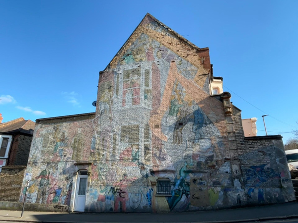
Even before Thatcher, however, some community artists felt that the radical origins of the mural movement had been co-opted by a hostile, dominating state. Yet some muralists were able to circumnavigate council bureaucracy. In 1975, for example, two arts educators, Carol Kenna and Stephen Lobb, formed Greenwich Mural Workshop (GMW). The following year, not far from today’s gleaming Greenwich Peninsula development, they created a mural on Floyd Road in Charlton that was commissioned by the Floyd Road Tenant’s Association to celebrate the defeat of council plans to knock down and redevelop half the street. Painted with the help of the staff of the Neighbourhood Community Centre and local kids, the mural depicts residents pushing back the diggers and preventing demolition of their homes. Locals are shown making repairs to the terraces, fixing the render, putting in new window sashes, making curtains; kids are playing, having fun, the community coming together to celebrate. And the residents did manage to keep the developers away: though the brickwork might need repointing and the paint is heavily faded, both the terrace and the mural are still there today.
By receiving funding from council housing associations, direct from the local people, Greenwich Mural Workshop could give voice to the wants and desires of underinvested communities that had been subject to managed decline. GMW’s first commission was for the Tenants of Meridian Estate in Greenwich, a mural on the gable end of Creek Road. Kenna and Lobb talked through ideas with the tenant’s association first, made a number of designs, which they discussed at meetings and by going door to door, then chose the most popular: The People’s River, which Lobb described as ‘calling attention to the estate being on the edge of the Thames – which at that time was largely unused – not much transport, boating or ferries – a sort of dead space that had been thriving [...] “Take back the river” became the image [for the mural]’. The river is pictured abruptly stopping before the estate, at Christopher Wren’s grand Old Royal Naval College, a symbol of burgeoning imperial wealth and power. Residents – black, white, young and old – are depicted hauling the ends of the river towards Meridian, bringing with it boats and trade. Cranes are lifting goods ashore from the barges, buses on the banks are running back and forth, residents are laughing and having fun – it is a joyous carnival of dance and music.
The building has since been demolished and the mural with it, but it spoke to residents’ desire for a share in the benefits of regeneration, to make it their own. Urban renewal doesn’t have to tear communities apart; on the contrary, it might elevate local people’s lives. It is not that poor, deprived neighbourhoods should not change or that they should remain neglected by the state, but that change should not mean cultural ‘greying’ and forced evictions. Unlike GMW’s Charlton mural, which was painted to resist redevelopment and deracination, The People’s River imagined and sought to manifest a more prosperous future for the neighbourhood, for the benefit of residents not the profit of developers, against gentrification and the constant feeling of rootlessness. Here we see that public art might offer something like a projection of community hope – if it exists in idea form, then you can build it.